一、基本用法
1.使用keyframes定义动画关键帧
使用@keyframes在动画序列中定义关键帧的样式来控制CSS动画序列中的中间步骤。
使用示例:
// 示例1: 仅定义起始帧和结束帧
@keyframes my-first-animation {
    // form 等价于0%
    from {
        background-color: green;
    }
    // to 等价于100%
    to {
        background-color: yellow;
    }
}

// 示例2: 定义多个关键帧
@keyframes my-second-animation {
    0% {
        background-color: green;
    }

    20% {
        background-color: yellow;
    }

    75% {
        background-color: blue;
    }

    100% {
        background-color: red;
    }
}
2.使用animation配置动画属性
animation是8个动画属性的简写。这8个动画属性为:
- animation-name 设置要使用的@keyframes动画的名称
- animation-duration 设置动画一个周期的时长
- animation-delay 设置延时,即设置元素加载完成后多久开始执行动画
- animation-direction 设置动画每次运行完后是反向运行还是重新回到开始位置重复运行
- animation-timing-function 设置动画的速度曲线
- animation-iteration-count 设置动画播放次数
- animation-fill-mode 设置动画执行前后如何为目标元素应用样式
- animation-play-state 设置动画播放状态,正在运行或暂停
使用示例:@keyframes my-first-animation { from { background-color: green; } to { background-color: yellow; } } div { animation: my-first-animation 2s; }
可以用于动画效果的属性清单
二、animation属性详解
1.animation-delay
定义动画于何时开始,即从动画应用在元素上到动画开始的这段时间的长度。
示例代码:
.ani--first {
    animation-name: aniFirst;
    animation-duration: 2s;
    animation-delay: 0s;
}
.ani--second {
    animation-name: aniSecond;
    animation-duration: 1s;
    animation-delay: 2s; /* aniSecond 延迟 2s 执行*/
}
2.animation-direction
指示动画是否反向播放
- normal 每个循环内动画向前循环,换言之,每个动画循环结束,动画重置到起点重新开始,这是默认属性。
- alternate 动画交替反向运行,反向运行时,动画按步后退,同时,带时间功能的函数也反向,比如,ease-in 在反向时成为ease-out。计数取决于开始时是奇数迭代还是偶数迭代
- reverse 反向运行动画,每周期结束动画由尾到头运行。
- alternate-reverse 反向交替,反向开始交替。动画第一次运行时是反向的,然后下一次是正向,后面依次循环。决定奇数次或偶数次的计数从1开始。
3.animation-timing-function
用于定义动画的速度曲线,常用值linear、ease、ease-in、ease-out、ease-in-out。这些值其实都是 cubic-bezier(n,n,n,n)的特例。它们被称为贝塞尔曲线。
除此之外还有阶梯函数steps(number_of_steps, direction)
- number_of_steps:阶梯数(必须是一个正整数),他将动画的总时长按照阶梯数等距划分
- direction :可选值为start或end,默认end,也可以不写;start表示动画的第一帧会被立即执行,直接从第二帧开始,然后以第一帧结束;end则表示动画从第一帧开始到正常结束;
[animation-timing-function演示示例](https://codepen.io/snaillu/pen/MWJERNa)
4.animation-fill-mode
设置CSS动画在执行之前和之后如何将样式应用于其目标。
none,默认值,当动画未执行时,动画将不会将任何样式应用于目标,而是已经赋予给该元素的CSS规则来显示该元素。forwards,动画完成后,元素状态保持为最后一帧的状态。backwards,动画将在应用于目标时立即应用第一个关键帧中定义的值,并在animation-delay期间保留此值。both,上述二者效果都有。
5.animation-play-state
一个动画是否运行或者暂停。可以通过查询它来确定动画是否正在运行。另外,它的值可以被设置为暂停和恢复的动画的重放。
- paused 暂停动画
- running 运行动画
6.animation-iteration-count
动画结束前运行的次数。可取值infinite、<number>。
三、进阶用法
1.利用animation-delay实现简单轮播
.slider__item {
    animation: ani 6s infinite linear both;

    @for $i from 1 to 4 {
      &:nth-child(#{$i}) {
        animation-delay: (-1+$i)*2s;
      }
    }
}
@keyframes ani {
  0%, 33.33% {
    opacity: 1;
    visibility: visible;
  }
  33.34%, 100% {
    opacity: 0;
    visibility: hidden;
  }
}
DEMO: https://codepen.io/snaillu/pen/MWJvMQz
2.序列动画
多个元素使用相同的动画效果时,将动画执行时机依次错开,可形成整齐有序的序列动画效果。
@for $i from 1 to 6 {
  .list__item:nth-child(#{$i}) {
    animation-delay: (-1+$i)*0.1s; /*设置每个元素的 animation-delay */
  }
}

@keyframes listAni {
  0% {
    transform: scale(0);
  }
  100% {
    transform: scale(1);
  }
}
DEMO: https://codepen.io/snaillu/pen/vYyqjpm
animation-delay 为负值会让动画从它的动画序列中某位置立即开始。
如若上述的序列动画要进行无限循环,单纯将animation-iteration-count 设置为 infinite,动画开始时会有延迟。此时,将 animation-delay 设置为负值,提前动画开始执行的时机,当用户看到动画时,动画便已经处于进行中的状态。
@for $i from 1 to 6 {
  .list__item:nth-child(#{$i}) {
    animation-delay: -$i*0.1s; /* 设置animation-delay 为负值*/
  }
}
3.动态图标
配合transform来实现图标变化效果。
transform中的常用函数:
- 平移函数:translateX、translateY、translateZ、translate、translate3d
- 缩放函数:scaleX、scaleY、scaleZ、scale、scale3d( number, number, number )
- 旋转函数:rotateX、rotateY、rotateZ、rotate、rotate3d( number, number, number, angle)
- 倾斜函数:skewX、skewY、skew
- 视域:perspective( length )
图标变换DEMO: https://codepen.io/snaillu/pen/MWJEWdR@keyframes spin1 { 0%, 15% { transform: translateY(-15px); } 20%, 25% { transform: translateY(0px); } 35%, 50% { transform: translateY(0) rotate(90deg); } 60%, 75% { transform: translateY(0) rotate(135deg); } 85%, 100% { transform: rotate(135deg) translateY(15px); } } @keyframes bgchange { 0%, 50% { background-color: none; } 35%, 50% { background-color: #42cf69; } 60%, 75% { background-color: #cf4242; } 85%, 100% { background-color: #dba528; } }
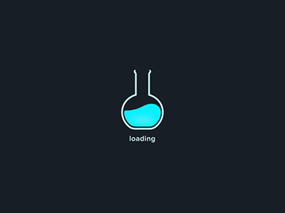
loading图标DEMO: https://codepen.io/snaillu/pen/JjYyvWY
四、CSS动画库
1.Animista
选择不同的动画
我们可以选择想要的动画类型(例如entrance/exist),除了可以选择某个动画(例如,scale-in)外,甚至还可以为该动画选择不同的展示效果(例如: scale-in-right)。定制
Animista还提供了一个功能,允许我们定制动画的某些部分,比如
- duration
- delay
- direction
生成css代码
选择适合自己需要的动画后,我们可以直接从网站上获取代码,甚者可以进行压缩:下载代码
另一个好用的功能是,可以把自己收藏自己喜欢的动画,然后一起下载下来, 或者,我们也可以选择将这些动画的代码复制到一起。
2.Animate.css
- 使用npm安装或者CDN引入;
npm install animate.css --save <head> <link rel="stylesheet" href="https://cdnjs.cloudflare.com/ajax/libs/animate.css/4.1.1/animate.min.css" /> </head> - 标签上使用类名
<h1 class="animate__animated animate__bounce">An animated element</h1>3.Vivify
- 下载Vivify.min.css
- 引入
- 元素上添加类名